This presentation is password-protected.
This presentation is password-protected.
NEW VISUAL IDENTITY
Evolution, not rupture. Strengthening the brand through clarity.
Medienstürmer GbR — February 2026
DESIGN FRAMEWORK
Every strong identity starts with clear principles. We distilled Eurovent Certita Certification's core values into five design pillars — guiding every creative decision in this proposal.
Integrity
Clean structure, balanced composition, honest visual language — reflecting uncompromised standards.
Exclusivity
Distinctive details and premium craft that set the brand apart.
Sustainability
Natural palette, forward-looking aesthetic signalling commitment.
Innovation
Dynamic elements and modern patterns embracing new possibilities.
International
Universal clarity, scalable systems that travel across borders.
These five principles informed every decision in this proposal — from logo construction to colour palette to imagery direction.
INTEGRITY
Three entities share the Eurovent name. The 2025 rebrand brought Association and Market Intelligence together under one visual system — but Certification still stands apart. That's the gap we close.
EUROVENT ASSOCIATION
Unified in the 2025 rebrand. Shares the new visual system with Market Intelligence.
EUROVENT CERTIFICATION
Current identity. Different colour palette, different mark, no visual link to the parent brand.
OUR FOCUSEUROVENT MARKET INTELLIGENCE
Unified in the 2025 rebrand. Shares the new visual system with Association.
Certification is the only entity still visually disconnected from the family. The redesign brings it into alignment — while preserving the independence its role demands.
THE CHALLENGE
The current mark has served the brand well. But when we test it against our four remaining design principles, the gaps become structural — not cosmetic.
EXCLUSIVITY
INNOVATION
SUSTAINABILITY
INTERNATIONAL
Four principles, four gaps. The following sections show how the new identity resolves each one.
THE FOUNDATION
Before we show solutions, let's look at what Certification needs to align with. The 2025 Eurovent rebrand established a unified visual system — shared symbol, shared palette, shared construction logic. This is the target.
SHARED SYMBOL
The Eurovent "e" mark appears across all entities — a single recognisable element that binds the family together.
SHARED CONSTRUCTION
Every logo follows the same pattern: EUROVENT + entity name. Consistent structure, clear hierarchy.
SHARED PALETTE
A harmonised colour system where every colour carries semantic meaning — not decoration, but intent.
THE EUROVENT BRAND GUIDELINES
THE EXISTING COLOUR SYSTEM
Wet Soil Black
Stability
Forest Green
Trust
Cool Flow Blue
Security
Fresh Air Blue
Innovation
Grass Green
Sustainability
Bonfire Yellow
Growth
This is the visual language Certification needs to speak. The next sections show how — while preserving the independence and authority the certification mark demands.
OUR APPROACH
We don't need to start from scratch. The parent brand's "e" mark, the certification's recognised triangle shape, and the harmonised colour system — everything needed to unify the identity already exists. The question is how to combine them.
THE THREE BUILDING BLOCKS
THE EUROVENT "e"
The shared family symbol that binds every Eurovent entity. Currently absent from Certification.
From the parent brand
THE TRIANGLE SHAPE
A recognised certification format with decades of market presence. The shape people associate with "certified."
From the current identity
THE COLOUR SYSTEM
Six semantic colours already harmonised across the ecosystem. No need to invent — just adopt and extend.
From the 2025 rebrand
The new logo must be immediately recognisable as an evolution of the existing one — to avoid forcing manufacturers to replace all logos already present on materials and products. Both routes honour this constraint.
The building blocks define the form. But every shape, every colour choice must be in service of one idea — the promise at the heart of Eurovent Certification:
THE BRAND PROMISE
WE BUILD TRUST.
The slogan anchors the brand promise across all touchpoints — from programme seals to energy labels.
TWO WAYS TO BUILD IT
ROUTE 1
Continuity
Trust through familiarity — evolving a shape the market already recognises
Explore ↓
ROUTE 2
Motion
Trust rooted in the industry itself — a fan in motion traces the universal form of HVAC-R
Explore ↓
Scroll to explore both routes ↓
THE MOMENT
You've seen the system.
Now see the mark.
ROUTE 1
Keep the familiar ribbon layout from the current certification label. Replace the old spiral with the Eurovent "e" — the triangle anchors the mark on the left, text flows to the right. Instantly recognisable.
HOW IT'S BUILT
The certification mark is a fusion: take the ribbon shape, inject the Eurovent "e" and wordmark from the parent template — one unified badge.
RESULT — EUROVENT CERTIFIED PERFORMANCE
The ribbon badge mirrors the current certification label already on thousands of products. Manufacturers and specifiers recognise the format instantly.
The parent brand's signature mark replaces the old spiral, creating an unmistakable visual link between Association and Certification.
Mark + name + programme — all in a single badge. No ambiguity, no separate lockups needed. Works on labels, documents and digital at any size.
PROGRAMME SYSTEM
Each certification programme gets its own ribbon badge — the programme name sits directly inside the mark. One template, 40+ programmes, zero ambiguity.
AHU
LCP
HEX
BADGE → PROGRAMME SEAL
The ribbon badge condenses into a compact triangular programme seal — same DNA, distilled into a single mark for colour-coded programme identification.
PROGRAMME SEAL SYSTEM
Each certification programme gets a colour-coded variant from the Eurovent palette. One mark, one system — 40+ programmes, zero fragmentation.
LOGO FLEXIBILITY
The mark must work as a standalone totem, with its signature, or with the slogan — depending on the medium. Like Nike and Tesla: the symbol alone is enough.
Mark Only
Social avatar, watermark, stamp
Mark + Name
Documents, web header, print
App / Favicon
Browser tab, bookmarks, PWA
REGIONAL VARIANTS
The system accommodates regional adaptations within the unified framework. Each region keeps its distinct colour while sharing the same structure.
International
Cool Flow Blue — default mark
Middle East — High Ambient
Distinct colour for extreme-climate products
France — Eurovent Certita
Local naming, same visual system
HYGIENIC STAR SYSTEM
The current star rating for hygienic AHU certification (1-3 stars) is preserved and integrated into the new mark. Stars appear alongside the programme seal.
★ — 1 STAR
★★ — 2 STARS
★★★ — 3 STARS
Hygienic AHU evaluation — stars indicate quality level (VDI 6022-1 / DIN 1946-4 compliant)
EUROVENT ENERGY LABEL
The Eurovent Energy Label — affixed to manufacturers' products and used across sales assets — is redesigned to align with the new identity while keeping the familiar A-to-E rating scale.
This route prioritises recognition and market continuity. The ribbon layout stays, the triangle anchors the mark, and the "e" signals the brand has matured — not that it has changed.
HALFWAY THERE
Breathe in.
That was Route 1. Now exhale — and let the fan spin you into Route 2.
ROUTE 2
Every fan in HVAC-R traces the same shape when it spins: a circle. That universal form becomes our starting point — a shape born from the motion at the heart of the industry, extended into a certification ribbon, with the Eurovent "e" at its core. An identity rooted not in abstraction, but in the physical reality of the sector it certifies.
HOW IT'S BUILT
Start with what the industry knows: a fan in motion. Its circular path becomes the foundation — then extends into a certification ribbon carrying the Eurovent "e".
RESULT — EUROVENT CERTIFIED PERFORMANCE
Every fan blade traces a circle in motion. This isn't decoration — it's the shape of the industry itself. The most honest starting point for a mark that certifies this entire sector.
The circle extends into a ribbon — the universal symbol of certification and approval. Industry motion becomes trust mark. Form follows concept, not the other way around.
The Eurovent "e" sits inside the ribbon, creating the same parent-brand connection as Route 1. The ecosystem link is preserved — the "e" anchors the mark in the family.
HOW THE PROGRAMME SEAL IS BUILT
The same circle — now extending vertically into a compact programme seal. Add the Eurovent "e" and the system is complete.
RESULT — PROGRAMME SEAL
PROGRAMME SEAL SYSTEM
Each certification programme gets a colour-coded variant from the Eurovent palette. One mark, one system — 40+ programmes, zero fragmentation.
LOGO FLEXIBILITY
The ribbon works as a standalone mark or with its full name — depending on the medium. Like Nike and Tesla: the symbol alone is enough.
Mark Only
Favicon, app icon, social avatar
Mark + Name
Documents, web header, print
Favicon / App Icon
Browser tab, bookmarks, PWA
REGIONAL VARIANTS
The ribbon system accommodates regional adaptations. Each region keeps its distinct colour while sharing the same motion-derived form.
International
Cool Flow Blue — default mark
Middle East — High Ambient
Distinct colour for extreme-climate products
France — Eurovent Certita
Local naming, same visual system
HYGIENIC STAR SYSTEM
The current star rating for hygienic AHU certification (1-3 stars) is preserved and integrated above the ribbon mark. Stars crown the programme seal.
Hygienic AHU evaluation — stars indicate quality level (VDI 6022-1 / DIN 1946-4 compliant)
EUROVENT ENERGY LABEL
The Eurovent Energy Label — affixed to manufacturers' products and used across sales assets — is redesigned with the ribbon mark while keeping the familiar A-to-E rating scale.
This route starts where the industry starts: with motion. A spinning fan traces a circle, the circle extends into a ribbon, and the ribbon becomes a mark of trust — rooted in the physical reality of the sector it certifies, anchored in the Eurovent family by the "e" at its core.
DESIGN SYSTEM
Certification adopts the full Eurovent parent brand palette — no new colours, no visual detour. The same system, applied with the authority and precision that independent certification demands.
Every colour below comes from the Eurovent parent brand — we introduce nothing new. Hover to experience each at scale.
PRIMARY — FROM THE EUROVENT PARENT BRAND
SECONDARY & ACCENT — FROM THE EUROVENT PARENT BRAND
HOW THE FIVE BRIEF PILLARS MAP TO COLOUR
Integrity
Cool Flow Blue
Exclusivity
Bonfire Yellow
Sustainability
Forest Green
Innovation
Grass Green
International
Fresh Air Blue
TYPOGRAPHY
Noto Sans
The typeface of the Eurovent parent brand. Shared typography builds recognition across the entire ecosystem.
TYPE SCALE
We Build Trust.
Eurovent Certified Performance
Independent third-party certification for HVAC&R
Certified products are tested and verified against international standards.
Programme: AHU · Certified since: 2019 · Certificate No. 12-04-587
"Certification is not a cost — it is a competitive advantage."
Headlines
Bold &
Black
Campaign titles, section headers, key statements
Sublines
Medium
Weight
Navigation, card titles, form labels, data callouts
Body
Light
Weight
Paragraphs, descriptions, certificate details, reports
Captions
Light
Italic
Footnotes, legal text, image credits, quotes
TONE OF VOICE
Distinct from the fresh, dynamic tone of the parent brand. The Certification sub-brand speaks with institutional authority. Hover each pillar for a concrete example.
Facts and standards over marketing language. Let data do the talking — not superlatives.
HVAC&R Example
"Tested to EN 1886. Thermal transmittance: 0.7 W/(m²·K)."
Not "best-in-class insulation" — the certified number speaks for itself.
Clear statements, measurable quality criteria. Every claim anchored to a verifiable value.
HVAC&R Example
"COP verified at 4.12 under Eurovent standard rating conditions."
No ambiguity — specifiers get the exact number they need to compare.
Emphasise industry expertise and independence. Position as the standard-setter.
HVAC&R Example
"Independently verified by Eurovent — the global reference for HVAC&R certification."
Independence is the core differentiator — own it in every sentence.
English as lead language, globally understood. One voice, worldwide reach.
HVAC&R Example
"Recognised across 60+ countries. One certificate, worldwide validity."
From Dubai to Stockholm — plain English, no jargon barriers.
IMAGERY & VISUAL LANGUAGE
Photography, iconography, illustration rules and graphic patterns — every visual decision traces back to the five design pillars. Nothing decorative, nothing arbitrary.


DO
DON'T
A purpose-built icon system and illustration language for the HVAC&R certification world — geometric, precise and animated where it counts.
ICON SYSTEM
Outlined, geometric icons on a 24 px grid. Consistent 1.5 px stroke, rounded caps, no fills. Each icon draws on with a clean stroke animation on scroll.
ILLUSTRATION PRINCIPLES
Technical and explanatory — not decorative. Every illustration clarifies a process, visualises data or explains a certification flow.
Flat & Minimal
IntegrityNo gradients, no 3D effects. Honest visual language — clean geometric shapes, nothing decorative.
Animated on Purpose
InnovationStroke draw-on, sequential reveals and subtle pulses — dynamic elements that guide the eye, never distract.
Brand Palette Only
Sustainabilityev-blue, ev-green and ev-dark exclusively. A disciplined, natural palette — no waste, no visual noise.
Grid-Aligned
InternationalProcess flows and technical diagrams snap to the brand grid — universal clarity that scales across markets and media.
EXAMPLE: CERTIFICATION PROCESS FLOW
Animated illustrations bring process diagrams to life — guiding the viewer step by step.
Manufacturer submits product data and test reports
Independent lab verification against EN/ISO standards
Expert review, on-site audits and data cross-checks
Programme seal granted — listed in the Eurovent directory
The certification triangle — tiled as a repeating pattern for watermarks, dividers and background textures. A recognisable shape that reinforces trust at every touchpoint.
Diagonal and chevron patterns inspired by the Eurovent "e" — dynamic movement for accent strips, headers and presentation slides.
Large areas of solid brand colour with white typography — bold, distinctive and unmistakably institutional.
Five pillars, one visual language. Every asset — from a LinkedIn post to a trade-fair banner — traces back to Integrity, Exclusivity, Sustainability, Innovation or International reach. The logo is the anchor; the visual system is the proof.
THE WRAP-UP
That's the vision.
Now let's make it real.
DELIVERABLES
A comprehensive brand system — from logo to rollout-ready assets, fully aligned with the brief's expected deliverables.
Two creative routes with logo, subline and programme-specific seal variants for all 40+ programmes.
Comprehensive brandbook with logo usage rules, colour system, typography, spacing and do's/don'ts.
Brand narrative and positioning statement that anchor the certification identity within the broader Eurovent ecosystem.
Dedicated tone of voice guidelines — factual, precise, authoritative and internationally legible across all communications.
Website design concepts, email templates, newsletter layouts and social media kit.
PowerPoint master templates, letterhead, business cards, certificate layouts and print-ready files.
Visual direction moodboard and web mock-ups for the certification website redesign.
Updated Eurovent Energy Label with new mark, harmonised palette and modern typography — maintaining the A-to-E rating framework.
Middle East "High Ambient" variant, France "Eurovent Certita" adaptation, hygienic star system integration, and favicon/digital marks.
TIMELINE & PROCESS
We are currently in Phase 1 — and this pitch marks its midpoint. What you see here is the strategic and creative base from which we will explore, refine and develop the final identity together.
Discovery is complete. This pitch presents two creative directions — Continuity and Audacious Simplification — as a strategic foundation. Once a route is selected, we move into full design development.
Brand audit, stakeholder alignment, analysis of existing assets and constraints.
COMPLETE
Creative directions, logo concepts, visual language and strategic foundation.
THIS PITCH
Selected route refinement, full logo system, colour palette, typography, templates.
Brandbook, functional assets, web mock-ups, training & handover.
PHASE 1
Brand audit, stakeholder alignment, analysis of existing assets and constraints.
COMPLETE
YOU ARE HERE
Creative directions, logo concepts, visual language and strategic foundation.
THIS PITCH
PHASE 2
Selected route refinement, full logo system, colour palette, typography, templates.
Brandbook, functional assets, web mock-ups, training & handover.
This pitch is our starting point — a strategic and creative foundation. From here, we explore, test and refine together until the identity is exactly right.
ABOUT US
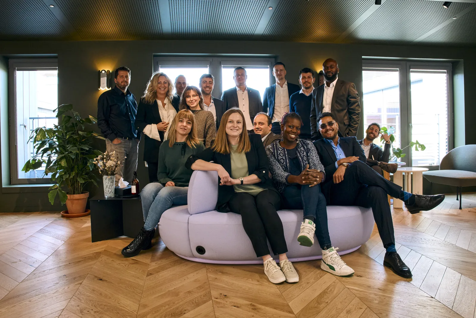
A digital experience agency based in Munich and Nuremberg. We are a team of 25 multidisciplined creatives, coders, strategists and communicators — building brands that move people and businesses forward.
25
TEAM MEMBERS
2
OFFICES
Munich & Nuremberg
360°
DIGITAL
Strategy to execution
∞
DISCIPLINES
Design, Code, Strategy, Content


WHY US
Medienstürmer built the Eurovent Association's brand system in 2025 — the same palette, typography, logo construction and sub-brand rules that Certification now needs to adopt. That means zero onboarding, zero guesswork.
We already work closely with Eurovent Association on their brand system. This collaboration gives us deep knowledge of the ecosystem, the stakeholders and the strategic direction — and could potentially allow for a streamlined extension of our existing engagement.
We built the colour system, the "e" mark, the typography rules. The entire brand foundation already exists in our files — ready to extend to Certification, not recreate from scratch.
Same agency, same system. No risk of a second agency misinterpreting the Association's brand rules. The result will be a seamless extension — one ecosystem, one hand.
Having built the Association's brand system, we can deliver the Certification identity with full consistency — no discovery phase, no misalignment, no duplication of effort.
CONTACT
Ready to shape the Eurovent Certita Certification visual identity — from strategy to rollout.
Felix Stürmer
Managing Director · Medienstürmer GbR
f.stuermer@medienstuermer.de